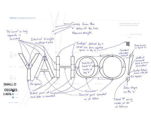
YAHOO! New Logo
 Yahoo! Has unveiled its first major logo change in 18 years. Yahoo logo has been mostly the same since 1995, but the last logo update was 2009 (18 years ago). Yahoo spent the month of August releasing teaser designs one a day, which was a setup for a more exciting swerve on day 30. This new change is trying to breathe new life into the brand.
The new logo retains many of its predecessor’s qualities, but unless you have studied design it’s hard to differentiate the new logo with the old one. The logo retains the traditional elements, the color remains purple, though a bit darker, the letters capitalized and rounding off with the signature exclamation mark. In some versions the exclamation dances around. Overall the look is sleek, cleaner with a new sans-serif typeface. See the previous logo below.
The unveiling generated a lot of an unfavorable buzz on social media platforms. Most of them were in favor of the old logo and widely viewed the new logo as a let down. More than three-quarters of Internet users prefer Yahoo’s old logo to the new logo, according to a survey of more than 400 online respondents Thursday from Survata, a market research group. See below.
My $0.02
Most people hate change, I would have guessed even before the release that consumers would vote for the old logo. This new logo is close to the old one, and I may not be a designer but that is a good outcome for Yahoo and its customers because they haven’t made a major change. Consumers can still identify with the color purple as well as the exclamation mark, and these two are the most important symbols for Yahoo.
In most recent years, companies like Gap, J.C. Penney, MasterCard, Microsoft and Tropicana have experienced disastrous logo changes. Yahoo will not experience a similar fate because it has clearly communicated through the change with the 30-day rollout. Most importantly Yahoo is not a physical product that consumers need to locate in stores. I doubt somebody will quit using Yahoo because the logo is so “a decade ago”.
The new logo shows a more serious look, signaling to consumers, investors, others in the tech world and employees that change is occurring. The 30-day rollout was successful in creating a buzz about Yahoo and sharing these variations prepared consumers for the change.
Even though this new logo generated a lot internet hate but if you think about it, a bad Yahoo logo made everyone talk about it. It was a successful campaign to get the media and consumers stay afloat for 30 days. On the whole, people are paying attention to Yahoo again. I believe in no time consumers will get used to the new logo. By the way, I like the new Yahoo fantasy football (soccer) layout. I Play for fun with people around the globe.
New Yahoo logo live stream.
The logo concept..


